, brings timeless warmth and balance to any room or exterior.)
SW Universal Khaki will work well in every room.
If you’ve been waiting for a neutral that feels both timeless and trend-forward, Universal Khaki (SW 6150) by Sherwin-Williams is it. Named the 2026 Color of the Year, this soft, mid-tone tan is proof that “neutral” doesn’t have to mean “boring.” Universal Khaki blends the best of earthy comfort and modern sophistication, making it the kind of shade that works everywhere—from cozy living rooms to sleek kitchens.
This color’s universal appeal (pun intended) is why designers and homeowners alike are already calling it a new classic.
Each year, Sherwin-Williams selects a Color of the Year to reflect larger cultural moods and design movements. For 2026, the company turned toward serenity, intentional living, and lasting style. Universal Khaki embodies these ideas with understated depth and warmth.
Sherwin-Williams describes the shade as “a beautiful balance of livability and longevity.” It bridges natural simplicity with modern durability—a direct reflection of today’s homeowners who value both comfort and enduring design.
In a time when trend colors come and go fast, Universal Khaki stays grounded. It’s adaptable, soothing, and steady—a backdrop for everything else you love.
Understanding the Color: Undertones and Character
At first glance, Universal Khaki looks like a straightforward beige. Look closer, and you’ll notice subtle yellow-green undertones that bring it to life. These undertones make the shade warmer than greige but softer than tan, allowing it to shift beautifully with changing light.
- In bright sunlight, the yellow-green note adds energy.
- In low light, it reads as cozy and grounded.
- Paired with natural wood or greenery, it feels organic and intentional.
This complexity is what sets Universal Khaki apart—it’s a chameleon color that flatters nearly every space.
Where to Use Universal Khaki in Your Home
1. Living Rooms and Gathering Spaces
Universal Khaki shines in high-traffic areas where you want timeless comfort. On living room walls, it wraps the space in soft warmth without overwhelming the décor. It pairs easily with cream upholstery, natural textures, and woven baskets.
2. Kitchens and Dining Areas
Want a neutral that still feels rich? Use this shade on cabinetry or kitchen islands. The khaki base harmonizes with brass hardware, butcher block, or stone countertops. For a modern farmhouse or transitional kitchen, this color offers both calm and character.
3. Bedrooms and Relaxation Zones
Bedrooms painted in Universal Khaki feel grounded and restful. Pair it with crisp white linens and textured throws for spa-like comfort. Add greenery or rattan accents for a subtle boho twist.
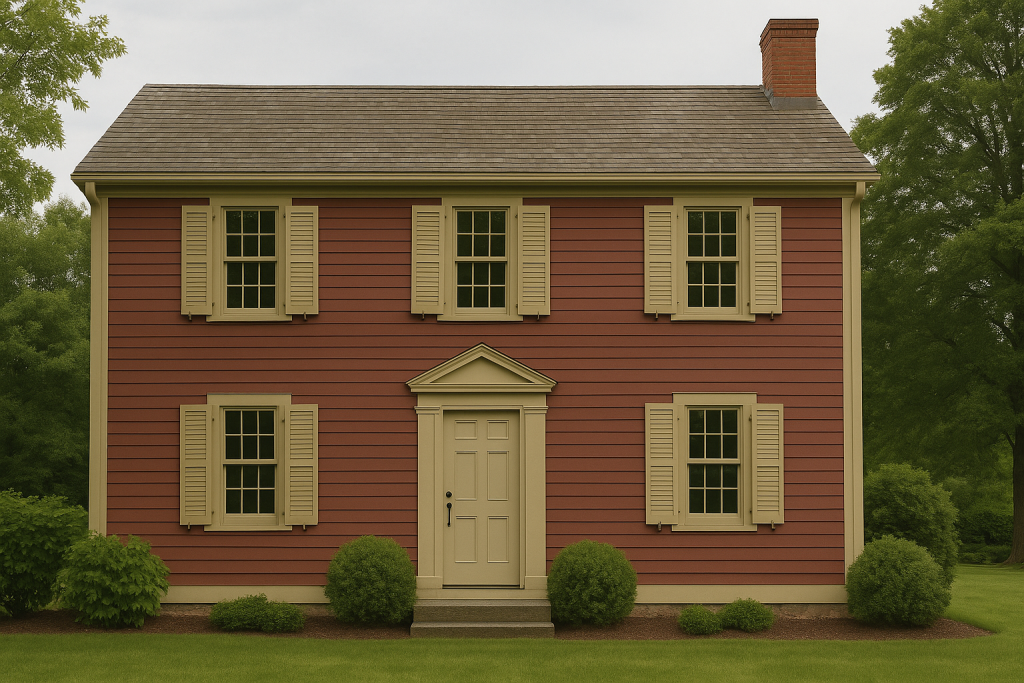
4. Exterior Applications
Because of its durability and visual balance, this hue works wonderfully for exteriors. It complements brick, natural wood, or white trim without ever clashing. It’s sophisticated, not stark—a great option for timeless curb appeal.
Pairing Colors That Work Beautifully
Universal Khaki is versatile enough to stand alone or serve as a base for more expressive palettes. Try these complementary tones:
Neutral Companions
- White Snow (SW 9541) – A crisp, clean trim that brightens without harsh contrast.
- Cream and Sugar (SW 9507) – Soft and inviting; ideal for layered neutrals.
- Neutral Ground (HGSW 7568) – Lighter and airy, perfect for ceilings or adjacent spaces.
Accent Partners
- Henna Shade (SW 6326) – A terracotta-inspired color that adds depth and energy.
- Cordovan (HGSW 6027) – A rich burgundy that brings sophisticated contrast.
- Secret Garden (HGSW 6181) – An earthy green that mirrors Universal Khaki’s undertones.
Material Pairings
- Wood tones: Walnut and oak highlight the warmth of the khaki base.
- Metals: Brushed brass and matte black add polish and edge.
- Stone: Travertine or pale marble amplify its natural vibe.
Design Style Compatibility
Universal Khaki fits almost every design direction:
- Modern Minimalist: Pairs effortlessly with clean lines, white oak, and matte finishes.
- Traditional: Works with antique woods, patterned drapery, and classic architecture.
- Rustic Farmhouse: Complements distressed textures, open shelving, and natural light.
- Contemporary Coastal: Matches woven accents, driftwood, and sandy palettes.
This adaptability makes it a foundational color that evolves with you over time.
The Mood Behind the Color
The selection of Universal Khaki echoes the cultural shift toward intentional simplicity. People are moving away from maximalist chaos and into calm, centered spaces that reflect purpose and peace.
Sherwin-Williams’ design team refers to it as “a color that finds strength in simplicity.” That’s more than marketing—it’s a reflection of how we live today. With flexible workspaces, smaller homes, and renewed appreciation for comfort, we need colors that make us feel safe and steady.
Universal Khaki does exactly that.
What to Watch Out For
No color is completely foolproof. Keep these tips in mind:
- Test before committing. Because of its undertones, lighting can shift the hue dramatically.
- Avoid pairing with very cool whites or bluish grays. They can clash with its warmth.
- Use the right sheen. Eggshell or satin finishes enhance its soft luster indoors, while low-luster paints maintain elegance on exteriors.
DIY Tips to Incorporate Universal Khaki
- Try a two-tone wall: Universal Khaki on the lower section, creamy white on top.
- Refinish old furniture with Universal Khaki paint for a refreshed neutral look.
- Use it on interior doors—it’s unexpected yet perfectly balanced.
- Create a gallery wall: neutral backdrop, colorful frames, and gold accents.
- Add Pinterest-ready vignettes—wood shelves, clay pots, and linen textiles—to highlight its warmth in lifestyle photos.
FAQ on Using Universal Khaki
Not at all. It’s a medium-depth tone that adds coziness without making a space feel closed in. Pair it with light trim and ample lighting.
Yes! It performs beautifully on siding, shutters, or porches. It weathers well and maintains color balance in natural light.
Only with warm grays—cool tones will fight its undertones. Greige or taupe fabrics blend seamlessly.
Opt for creamy whites like White Snow or Cream and Sugar. They keep things cohesive and soft.
Use warm lighting and natural materials. Include greenery, wood grain, or woven textures to make the khaki read inviting and dimensional.
The Takeaway: Universal Khaki Is the Perfect Neutral for 2026
Universal Khaki (SW 6150) isn’t just a color—it’s a mindset. It brings calm to chaos, warmth to modern minimalism, and a sense of timelessness to trend-driven design. Whether you’re refreshing one room or planning a full-home palette, Sherwin-Williams’ 2026 Color of the Year provides the perfect foundation to create a home that feels both grounded and fresh.